Graphs
Your findings can be presented with a range of graphical and mapping techniques. You should be able to justify each one.
Bar chart
- Nominal data.
- Categories on x-axis.
- Bar height represents frequency.
- Leave gaps between bars as data are discontinuous.
There are many variations on the basic bar chart, such as divided bar chart, percentage bar chart and bi-polar analysis bar chart.
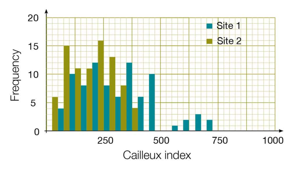
Histogram
- Interval or ratio data.
- Bar area shows frequency.
- Bars are not necessarily of equal width.
- No gaps between bars as data are continuous.
Pie chart
- Nominal or ordinal data.
- Area of circle segment represents proportion.
- Multiple pie charts can be used with the radius of the circle having meaning.
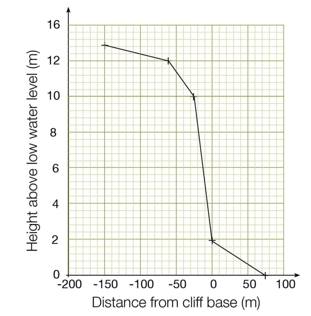
Line graph
- Ordinal, interval or ratio data.
- Both axes are numerical.
- If time is one of the variables, always plot it on the x-axis.
- Only join up the points if the data are continuous.
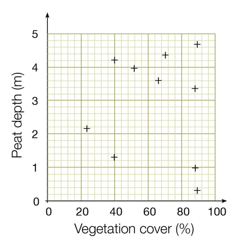
Scattergraph
- This needs one independent variable (on x-axis) and one dependent variable (on y-axis).
- Both axes need interval or ratio data, and both must be continuous data.
- Do not join up each point, but use a line of best fit instead.
Descriptive statistics for quantitative data
Measures of central tendency
Normal distribution
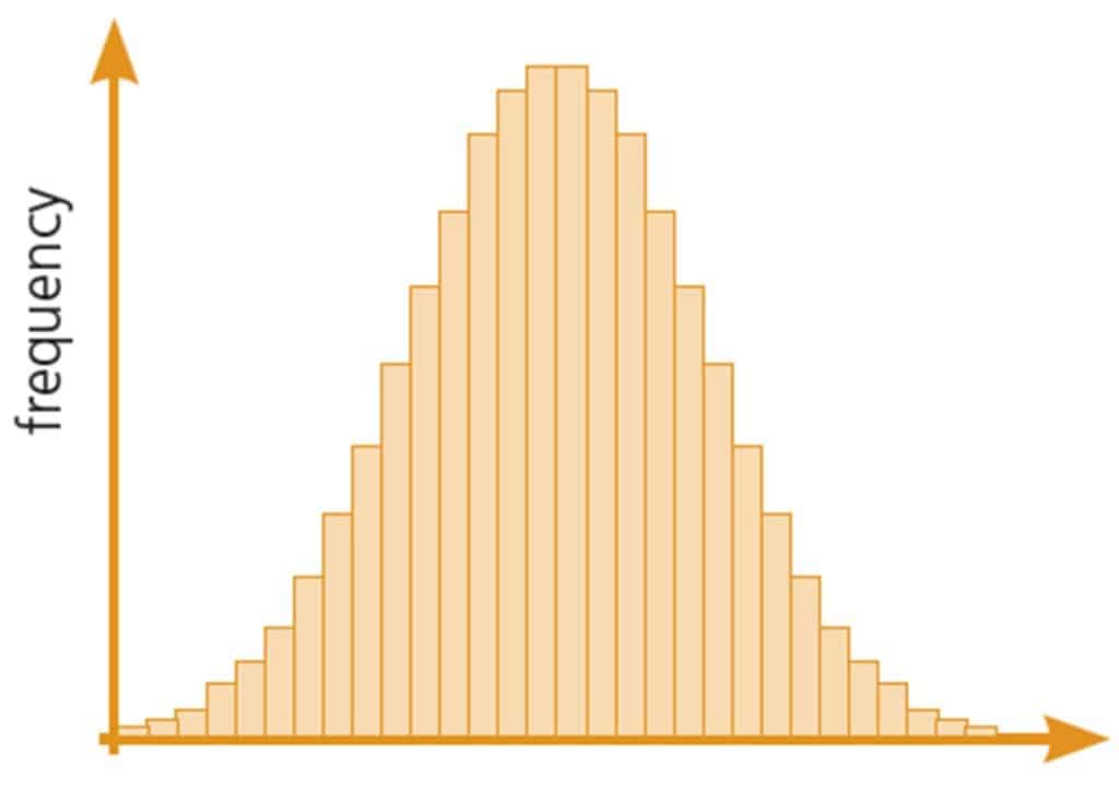
The symmetrical bell-shaped distribution from a large series of measurements plotted on a frequency histogram. The mean is in the middle, with an equal number of smaller and larger values either side of it.
Mean
Add all the measurements together then divide by the number of measurements taken. The mean can only be used if the data approximate to a normal distribution, and have an interval or ratio measurement scale.
Median
Arrange the data in order, and take the middle value as the median. It can be used for data which are not normally distributed. Suitable for variables with an ordinal scale.
Mode
The value which occurs most often. Suitable for variables with a nominal scale.
Measures of dispersion
Dispersion
The spread of data around the average,
If the data are normally distributed, use the interquartile range or the standard deviation. The usual way of expressing dispersion is as
mean ± interquartile range or mean ± standard deviation
If the data are not normally distributed, use the median and range.
Range
Range is the distance between the highest and lowest value.
Example: 12 17 21 23 24 24 25 26 29 31
Range = 12–31
Interquartile range is the part of the range that covers the middle 50% of the data.
If the variable has an interval or ratio scale and if the data are normally distributed, use the interquartile range or the standard deviation. Otherwise use the median and range to show dispersion.
Standard deviation
This is calculated using the formula below. In a normal distribution, 68% of values are within one standard deviation, 95% within two standard deviations, and 99.7% within three standard deviations of the mean.
\(s=\sqrt\frac{\sum x^2-(\frac{\sum x^2}{n})}{n-1}\)
Presenting qualitative data
Summary descriptions
Use field notes to help you describe behaviour. Brief descriptions, comments and quotations around key themes can also allow you to develop a narrative account of your data.
Narrative accounts
Interview data, using extracts and quotations around key themes allows you to develop an in-depth narrative account of your data. Narrative accounts are commonly presented in the first person and are used to illustrate a personal view, behaviour or attitude for example.
Multimedia data
Photographs, pictures and videos can be used to illustrate behaviours and provide contextual information. For example, annotated photographs can illustrate the different ways in which a local community uses recreational facilities.

Secondary and Further Education Courses
Set your students up for success with our secondary school trips and courses. Offering excellent first hand experiences for your students, all linked to the curriculum.
Group Leader and Teacher Training
Centre-based and digital courses for teachers