Present your findings with a range of quantitative and/or qualitative techniques. Each technique should be accurately drawn and appropriate for the information being presented. Here are some suggestions.
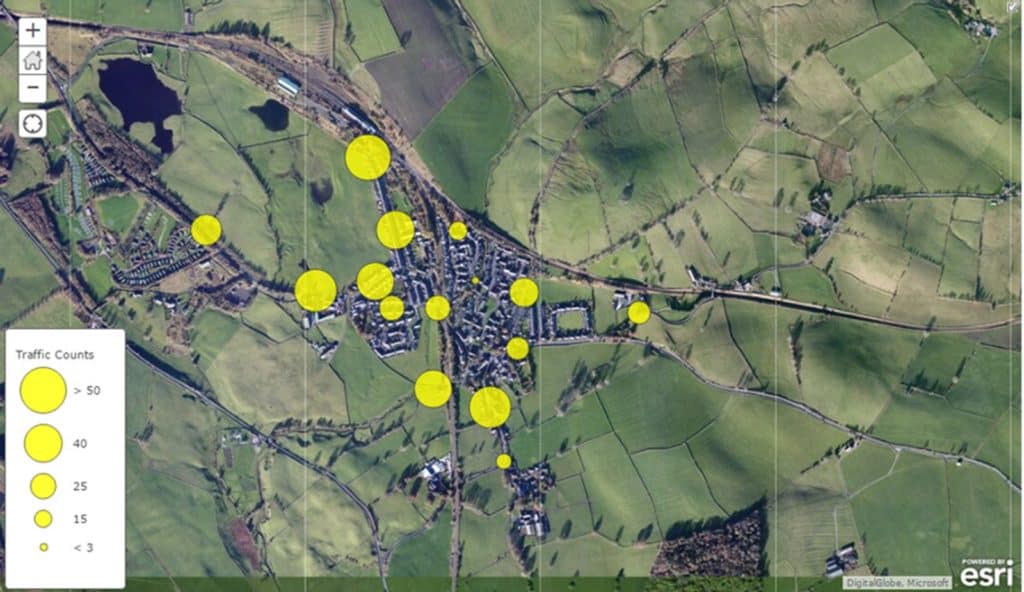
Located proportional symbols are a good way of presenting data such as traffic or pedestrian flows. If you have recorded direction of flow then proportional arrows could be used to show scale and direction of flow.
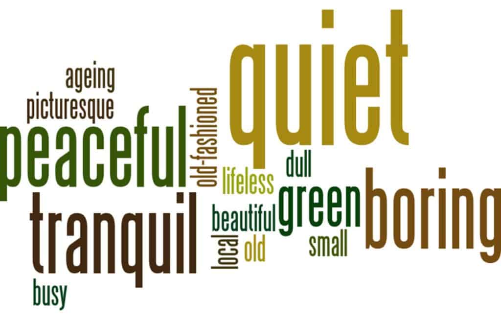
Questionnaire data can be difficult to present, particularly for open questions, where participants were invited to share their opinions in their own words. Word clouds, where more popular words are displayed in larger text as below, are one possible solution. These can be constructed online using a word cloud generator, for example Mentimeter.
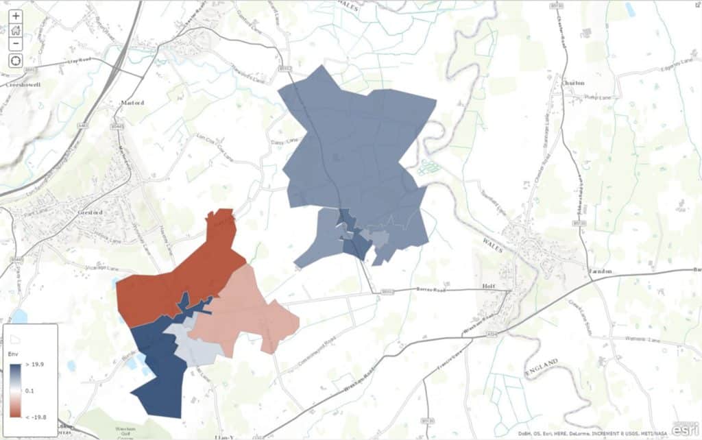
A choropleth map is one in which data is grouped into different categories, and each category is coloured or patterned according to a key.

Secondary and Further Education Courses
Set your students up for success with our secondary school trips and courses. Offering excellent first hand experiences for your students, all linked to the curriculum.
Group Leader and Teacher Training
Centre-based and digital courses for teachers