Present your findings with a range of quantitative and/or qualitative techniques. Each technique should be accurately drawn and appropriate for the information being presented. Here are some suggestions.
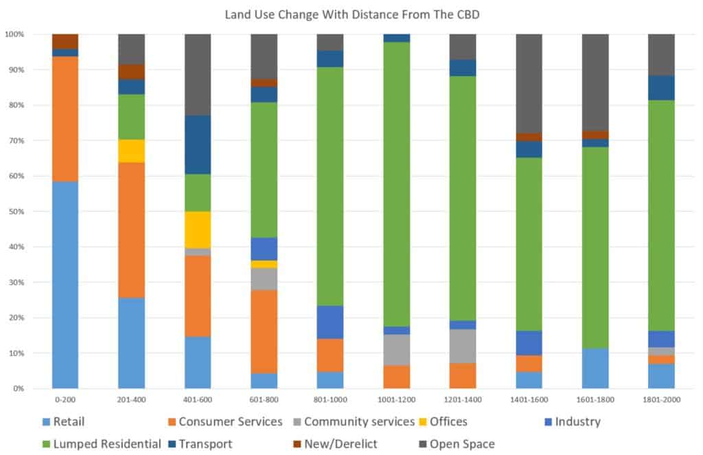
Here a composite bar graph has been used to show changes in land use with progression from the centre of the CBD.
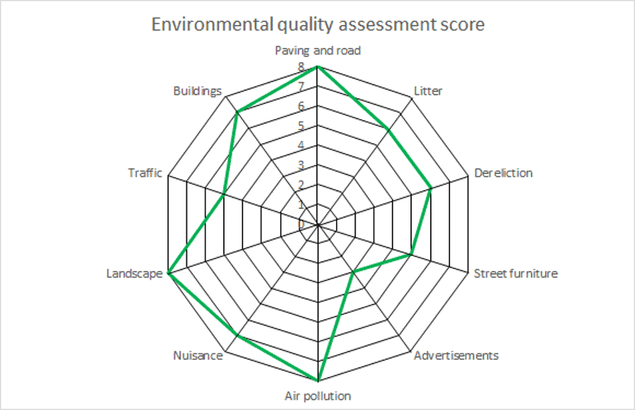
Radar graphs are a powerful way of presenting transect data. In the following example, radar graphs have been used to show Environmental Quality Assessment (EQA) scores in various categories in an area.
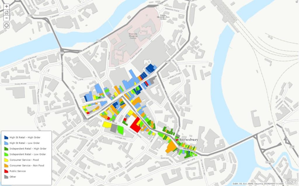
GIS can be used to create a thematic map, as shown in the example below. From this map you can easily identify areas of chain store retail in certain streets with areas of independent retail along other streets.
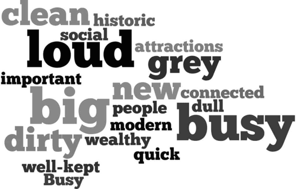
Questionnaire data can be difficult to present, particularly for open questions, where participants were invited to share their opinions in their own words. Word clouds, where more popular words are displayed in larger text as below, are one possible solution. These can be constructed online using a word cloud generator, for example Mentimeter.
Secondary and Further Education Courses
Set your students up for success with our secondary school trips and courses. Offering excellent first hand experiences for your students, all linked to the curriculum.
Group Leader and Teacher Training
Centre-based and digital courses for teachers