Present your findings with a range of quantitative and/or qualitative techniques. Each technique should be accurately drawn and appropriate for the information being presented. Here are some suggestions.
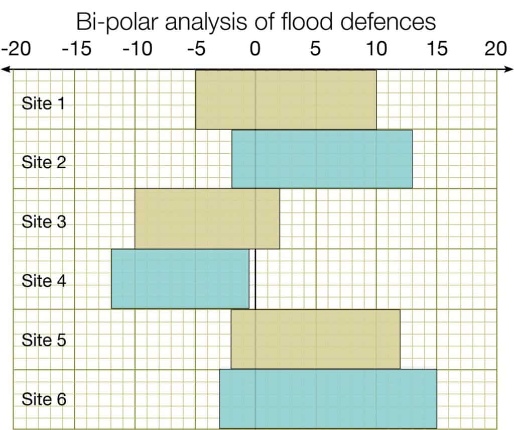
Bi-polar analysis
One way of displaying the results of the bipolar analysis is to draw a bar chart with the bi-polar score on the x-axis and labels on the y-axis.
Find the total of all the negative scores and all the positive scores for each settlement. The example below shows what this might look like.
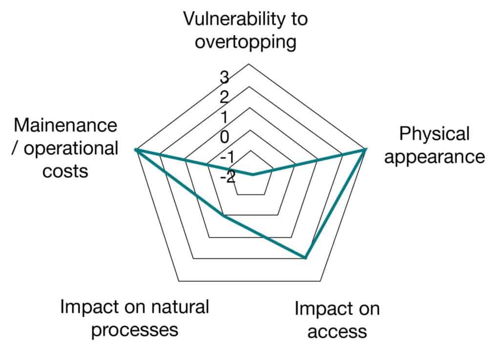
Radar diagrams
Bi-polar results can also be displayed on radar diagrams. Multiple radar diagrams can be located on a base map.
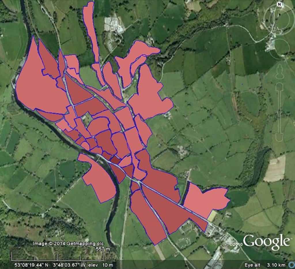
Chloropleth maps
Chloropleth maps are shaded according to a key.
The example below shows flood risk around Llanrwst, North Wales. A darker colour represents a greater risk of flooding.
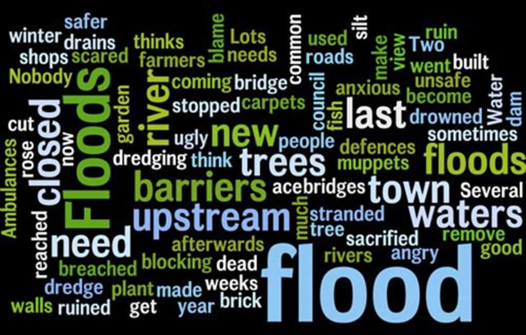
Word clouds
Questionnaire data can be difficult to present. Closed questions, where participants were required to select an answer from a range of categories, may be possible to present using bar graphs or pie charts.
Open questions, where participants were invited to share their opinions in their own words, are likely to be more difficult. Word clouds, where more popular words are displayed in larger text as below, are one possible solution. and can be constructed online using a word cloud generator, for example Mentimeter. Here is an example.

Secondary and Further Education Courses
Set your students up for success with our secondary school trips and courses. Offering excellent first hand experiences for your students, all linked to the curriculum.
Group Leader and Teacher Training
Centre-based and digital courses for teachers