Describing your results
Describing bar charts
For each bar chart write a few sentences about which are the highest and the lowest bars. Include numbers from the bar chart to make the comparison clearer.
The bar chart below shows mean cross-sectional area at five sampling sites along a stream.
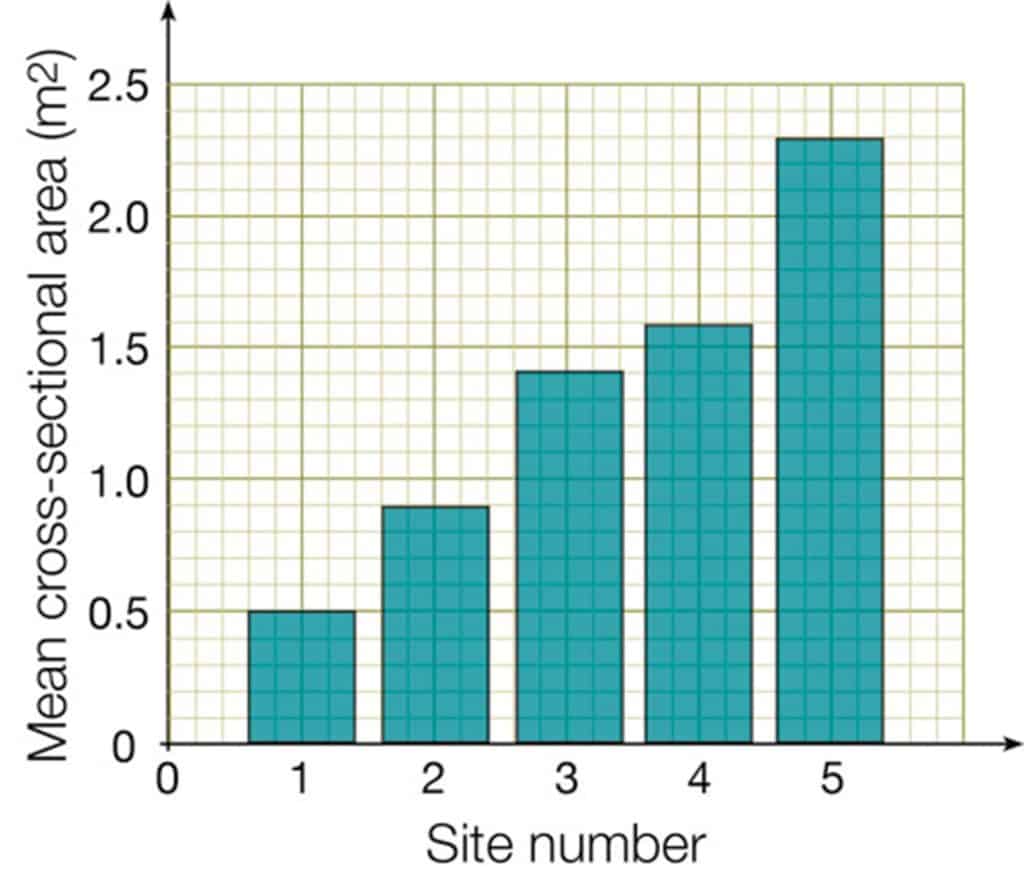
Site 1 has the lowest cross-sectional area (0.5 m2). Site 5 has the highest cross-sectional area (2.3m2). The cross-sectional area at Site 5 is approximately five times larger than the cross-sectional area at Site 1.
Describing line graphs
Write a few sentences about the trend that you can see, for the line graph below. Is it a smooth line or a zig-zag?
The line graph shows infiltration rate over time.
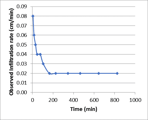
Infiltration rate decreases over time from 0.08cm/min to 0.02cm/min. The decrease is rapid from 0 minutes to 0.02cm/min at 200 minutes, then plateaus from 200 to 800 minutes.
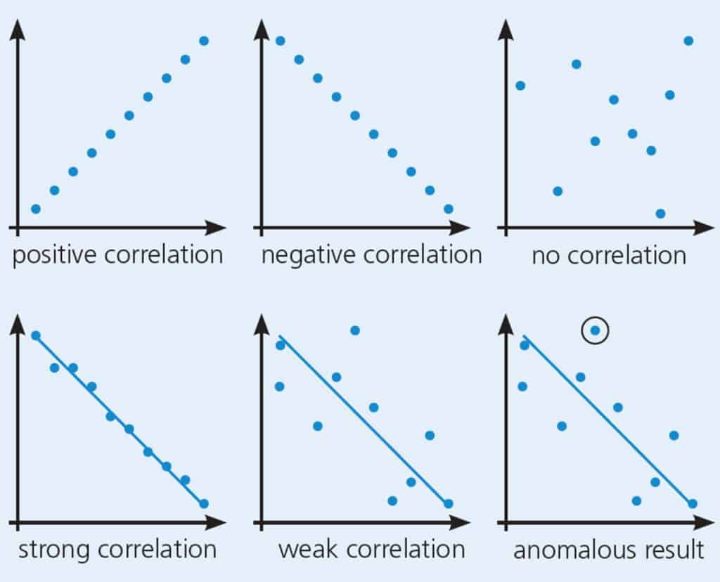
Describing scattergraphs
For each scattergraph write a few sentences about:
- the direction of the relationship (is it positive, is it negative, or is there no relationship?)
- the strength of the relationship (is is strong, or is it weak?)
- if there any anomalous results (points that lie a long way from the best-fit line)?
Explaining your results
Go through each table, chart and graph in turn. Write a few sentences to explain what you have just described. Try to use geographical words as much as you can.
The best explanations will give reasons for the strength of relationships and for any anomalous results.
Example: The scattergraph is a plot of mean cross-sectional area against mean velocity. There is a positive relationship between the two variables. As cross-sectional area increases, velocity also increases. The best-fit line shows that it is a fairly strong relationship. The points are close to best-fit line.
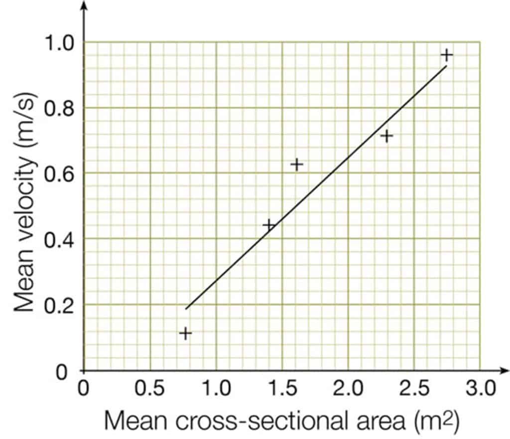
Why? An increase in cross-sectional area means that the river is becoming wider and deeper. A smaller proportion of the water in the river is in contact with the bed and banks. This means that less energy is lost to friction, so the water has more kinetic energy and can move faster.
It is not a perfect relationship because different shaped channels have different wetted perimeters. A square-shaped channel loses less energy to friction than a wide and shallow channel.
Go back to your aims, key questions or hypotheses
In this section you bring the threads together and answer your hypotheses.
Link your results together. For example, try to link results for width, depth and wetted perimeter with results for gradient.
If you have used secondary data, try to link this to the primary data that you collected.
Make sure you mention the evidence from your results that backs up each conclusion.
Finish off with something along the lines of:
“These results support / do not support my initial hypothesis, which stated that… This is because…”

Secondary and Further Education Courses
Set your students up for success with our secondary school trips and courses. Offering excellent first hand experiences for your students, all linked to the curriculum.
Group Leader and Teacher Training
Centre-based and digital courses for teachers