Data
Quantitative data records quantities (e.g. numbers, sizes, frequencies).
Qualitative data records subjective qualities (e.g. opinions and attitudes).
Discrete data can only take certain values (e.g. whole numbers)
Continuous data can take any value (e.g. length, width, time)
Justifying your choice of data presentation
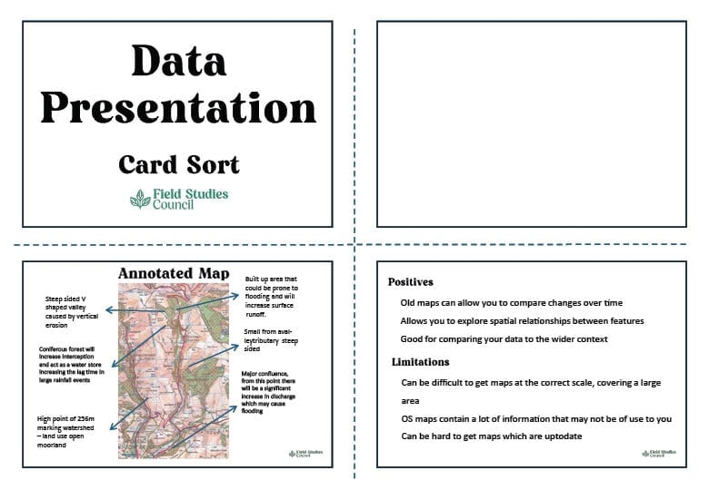
Your findings can be presented with a range of graphical and mapping techniques. Each form of data presentation needs to be justified. Here is an example.
| Fieldwork technique | Systematic sampling along a transect from the Peak Land Value Intersection to the edge of the CBD. An environmental quality score was calculated at every 30 metres. |
| Data presentation | Bar graph with distance from PLVI on x-axis and environmental quality score on y-axis. |
| Bad justification | The bar graph shows how environmental quality changes as distance increases from the PLVI. |
| Good justification | A bar graph is appropriate because both distance from the PLVI and environmental quality score are numerical and discrete categories. |
Try this interactive resource with students to help understand the uses of different data presentation techniques
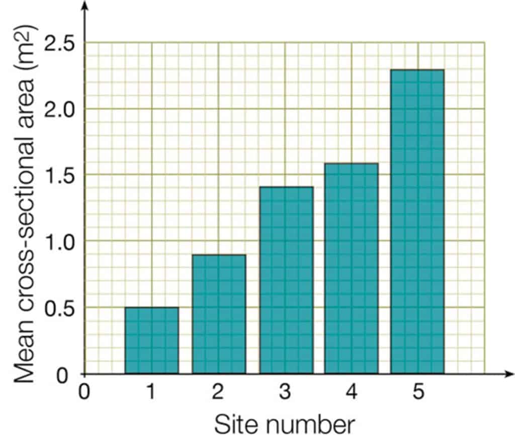
Bar charts
Bar charts are used to show the numbers of things (or frequency) in several categories
- Plot the categories on the x-axis
- Leave gaps between the bars as data are not continuous (called discrete data)
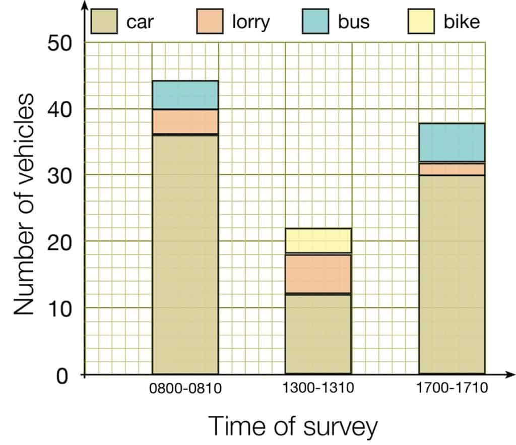
Divided bar charts
Divided bar charts are used to show the frequency in several categories, like ordinary bar charts. It is a type of compound bar chart. But unlike ordinary bar charts, each category is subdivided.
- Plot the categories on the x-axis
- Leave gaps between the bars as data are discrete data
- Use colours or shading to show the subdivided categories, and include a key
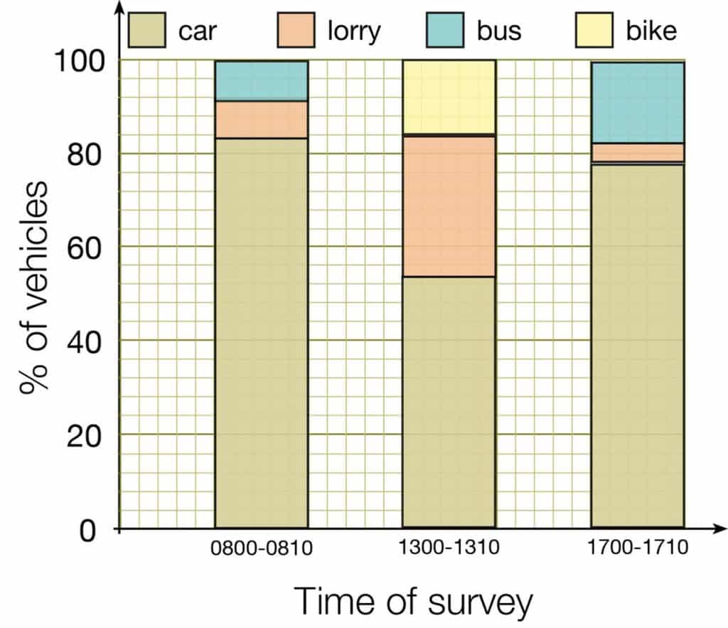
Percentage bar charts
Percentage bar charts are used to show the percentage of each subdivision in several categories. It is a type of compound bar chart.
- Plot the categories on the x-axis
- Leave gaps between the bars as data are discrete data
- Use colours or shading to show the subdivided categories, and include a key
- Each bar should be the same height (i.e. 100%)
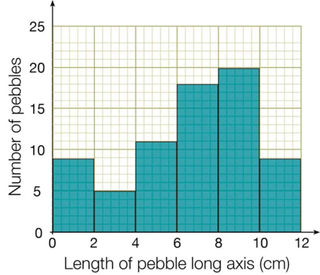
Histograms
Histograms are used to show the numbers of things (or frequency) along a continuous scale
- Plot the sliding scale on the x-axis
- Do not leave gaps between the bars as data are continuous data
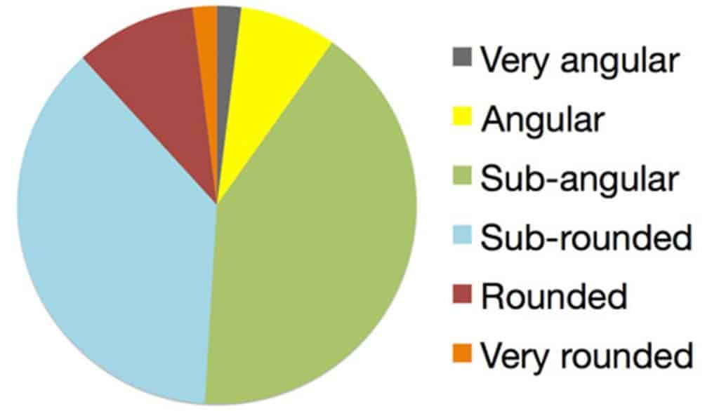
Pie charts
A pie chart is a circle divided into sectors. Each sector represents a percentage.
- Sectors can be shaded or coloured, and need labels or a key
- Multiple pie charts can be used where the size of each circle shows ratio.
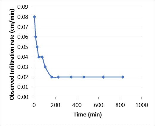
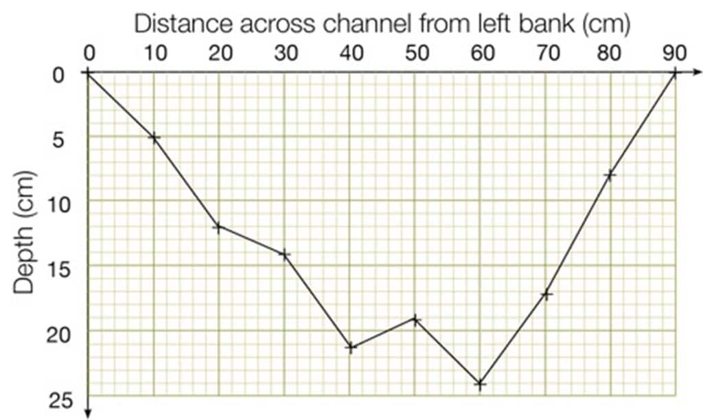
Line graphs
- Both axes are numerical and continuous i.e. each data point could be any value along the scale.
- If time is one of the variables, always plot it on the x-axis.
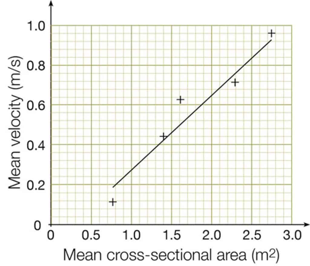
Scatter graphs
- This needs one independent variable (on x-axis) and one dependent variable (on y-axis).
- Both axes must show ordinal data.
- Do not join up each point: use a line of best fit instead, if appropriate.

Secondary and Further Education Courses
Set your students up for success with our secondary school trips and courses. Offering excellent first hand experiences for your students, all linked to the curriculum.
Group Leader and Teacher Training
Centre-based and digital courses for teachers