Maps are a powerful technique for representing spatial relationships, but they can take a long time to draw by hand. GIS software can quickly draw a range of maps from your data, making it easy to pick the most appropriate map for your enquiry question and for the data type and location.
By mapping your data, you retain the spatial relationships between, and can draw from the information contained within the map to aid your analysis.
In the same way that you would choose a different type of graph depending on the data you are presenting your maps should be appropriate to the data you are presenting.
Raw data may be Categorical, Ordinal or Numeric.
- Categorical Data: variables are not numerical (e.g. land use, gender, ethnicity) although numbers may be used as “labels” for different categories (e.g. 1 = Open Space, 2 = Residential)
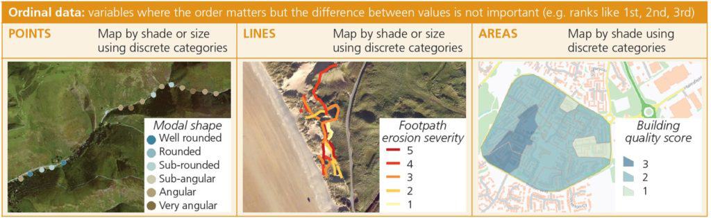
- Ordinal Data: variables where the order matters, but the difference between values is not important. (e.g. ranks – 1st, 2nd, 3rd. Bedload roundness using the Powers scale – 1 = Very Angular, 2 = Angular, 6 = Well Rounded)
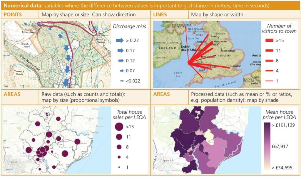
- Numeric Data: variables where the difference between values is important (e.g. distance in metres) – sometimes divided into interval and ratio data types
Data could be processed to create a Normalised value.
A count of detached houses in a census output area is an example of ratio data. A direct comparison between two areas would not consider the in the total number of houses in each area. Calculating the percentage of detached houses (out of all houses) in each area creates a normalised value, allowing for direct comparison of the values. Similarly, population density would be a normalised measure of population between different sized areas. Using mean, median or mode is another way of creating normalised values.
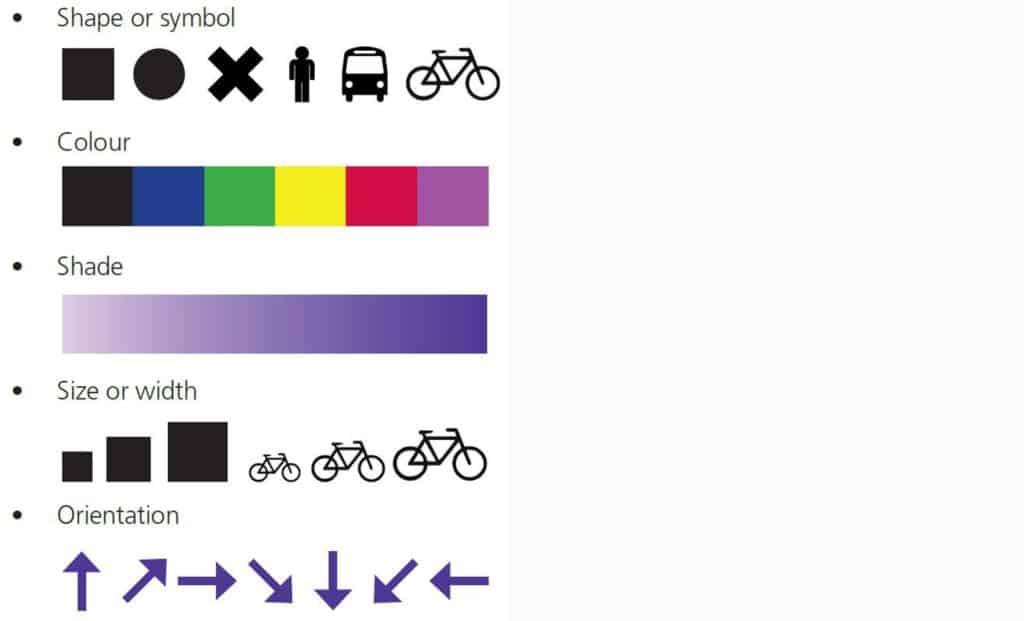
A mapping toolkit
You can present any data on a map by changing one or more of five key characteristics.
Map making In ArcGIS Online
ArcGIS Online uses Smart Mapping to make it easier to create maps from your data, this is really useful, but sometimes going beyond the default settings will make your data presentation even better!
Before you can map your data, you need to add it as a layer in the ArcGIS Online Map Viewer.
If your data is in a spreadsheet (with latitude and longitude, postcode, or other address location).
If your data was collected via the ESRI Survey 123 app a layer will exist either in your My Content, or in a Group that you are a member of. Find layers via the Add button in the map viewer.
Choosing appropriate maps
The most appropriate map to draw depends on the data you have collected
- What type of location does your data set represent? Point, Line or Area?
- Are you mapping Categorical, Ordinal or Numerical Data?
Careful use of colours
The colours you use in your mapping have a big impact on how easy it is to understand;
- Categorical data – Use colours that make sense – eg. grey for urban land use, light green for grass, dark green for woodland.
- Ordinal and numerical data – for simple scales use a “High to Low” scale where darker shades represent higher values.
- For bipolar scales use an “Above and Below” scale to highlight both positive and negative assessments. This type of scale can also highlight the highest and lowest values within a range – for example the top and bottom 10% or either side of the mean value.
- Choose your base map carefully – The colour of the underlying map can make it hard to interpret the overlay. Putting located proportional symbols over a very detailed map can make it hard to identify the data points.
Mapping categorical data
Mapping ordinal data
Mapping numerical data

Secondary and Further Education Courses
Set your students up for success with our secondary school trips and courses. Offering excellent first hand experiences for your students, all linked to the curriculum.
Group Leader and Teacher Training
Centre-based and digital courses for teachers