Trends and patterns can be difficult to recognise, especially when a large number of data points are presented on a map. To help make sense of the information that you have collected, GIS software offers a range of tools to summarise raw data, carry out calculations and find spheres of influence.
By presenting data spatially you might have begun to notice patterns in the data. e.g.
- Similar results might be clustered together.
- Similar results might be found in similar types of locations.
- Results might change across distance, e.g. with distance from a point of interest.
The analysis tools within GIS software can be used to explore these patterns further through some processing of the data.
Summarise tools
Summarise (or Aggregate) tools simplify multiple points into areas or fewer points. There are two important tools: Summarise Within and Summarise Neaby. The examples below show how these can make patterns clearer.
Summarise Within
Summarise house prices for individual properties to give maximum, minimum and average house price for the census LSOA they are in.

Summarise Nearby
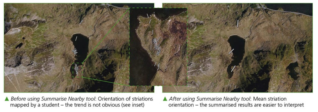
Summarise orientation of striations mapped to give an indication of general direction of ice flow. GIS used to create average striation direction from all measurements taken within a given distance.

Proximity tools
Proximity tools such as Buffer or Travel time area tools allow us to create new locations based on distances or travel times from existing locations, these might be used on their own, or as the areas for summarise or aggregate functions.
Connect origin to destination tools join multiple points to a single origin or destination, as well as calculating distance or travel times for flow maps or answering questions on sphere of influence.

For more information on the analysis tools in ArcGIS Online see the ArcGIS Online help pages.

Secondary and Further Education Courses
Set your students up for success with our secondary school trips and courses. Offering excellent first hand experiences for your students, all linked to the curriculum.
Group Leader and Teacher Training
Centre-based and digital courses for teachers
Experiences for Young People
Do you enjoy the natural world and being outdoors? Opportunities for Young People aged 16-25.
